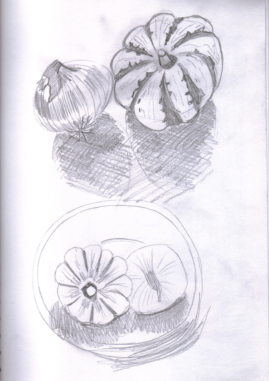
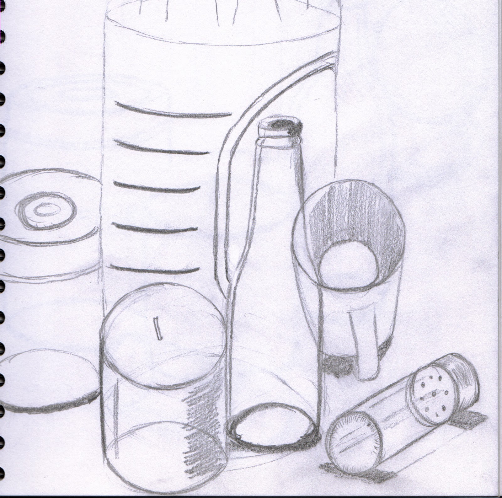
Thursday 28 October 2010

Assignment One - Second Drawing

Second Drawing


For this drawing I chose some kitchen objects, I wanted to include the tiles on my counter tops as these are quite reflective and give off interesting shapes. This was difficult though as I had to do the preliminary sketches standing up and the lighting isn't very good in my kitchen. However, I perservered and am quite pleased with the final results. I think the composition works well and the objects fill the page well. I decided to use pastel pencils for this, which I wish I hadn't used. It was difficult to use cros hatching and the paper I was using wasn't right for pastels, I ended up nearly rubbing away parts of the paper. I'm not happy with the way I did the shadows in front of the kettle either, it just looks like a big black patch, I wish I had used a darker shade of blue. I think I made a good selection of objects, its not too busy, but i did find it hard doing the spoon.

Assignment One

Natural Forms


Preliminary Sketch


For the first drawing I chose to use various vegetables which I thought had interesting shapes, patterns and texture. I tried a number of compositions and did find it difficult fitting all the vegetables on the A2 paper. This was mainly down to the fact that I wanted to include 3 sweetcorns, one closed, one partly peeled and one completely peeled. I wanted to do this to show the various textures of the cob, but found it hard fitting them in. There seemed to be a lot of negetive space around the bottom third of the sketch, so I decided to add an extra onion, which helped balance the composition a little but there is still a lot of space on the bottom right side.  I found the drawing ok, but found hatching and mark making slightly difficult with the coloured pencils. If I were to do this again I would try using an A1 piece of paper to improve the composition.

Still Life

Exercise: Still life sketches of made objects


Check & Log

I found it easier to suggest three dimensions on man-made objects rather than natural. I found it easier to suggest form and volume with the contents of my handbag, this may have been down to the shapes of the objects. The composition seems more rigid and I was able to create a sense of solidity within the objects by using different mark making techniques to build up shades.
Changing the arrangement of the composition did make a difference to the way I approached the drawing, once  I was happy with the compositon and felt the objects were balanced.
A number of factors helped me to decide how to position myself in relation to the objects. These included lighting, availability of space and how comfortable I was when drawing.


Wednesday 27 October 2010

Reflected Light

Exercise: Shadows and reflected light and shade


This exercise didn't go very well. I think I was too concerned with the composition and filling the A2 piece of paper. Again the shadows are too dark due to me having the lamp to close to the subject and there isn't really any gradual build up of tone for me, its just too contrasting. I think I need to go back and practice the gradual tonal process and also think about the lighting situation and try to make an effort to draw in natural daylight more.

Reflected Light

Exercise: Study of light reflected from one object to another.


Light reflected from one object to another


I tried to use as many shiny reflective items as I could with this drawing. I think it works well and I like the composition. Looking at the drawing now I can see that on the glass spice jar that is reflected in the cheese grater, I have missed the reflections and highlights. The shadow that the cheese grater is casting behind the glass jar should also have included the light areas where the light is shining through the holes, nevermind.


Tone and Form

Exercise: Observing shadow and light formations on a surface

Shadow & Light 1


Shadow & Light 2


Tonal Studies

I found these exercises quite enjoyable, however, I think I may have placed the lamp too close to the subject matter as the shadows are too strong. I think I have achieved expressing the tonal graduations fairly well in Shadow & Light 1, but not in Shadow Light 2. I wish I had tried the same exercise with natural daylight to see what difference it would make. I really don't like the dark shadows on these drawings!

Basic Shapes & Fundamental Form


Boxes & Books 1


Boxes & Books 2


Jars & Jugs 1


Jars & Jugs 2

Jar & Jugs (Pen)


Supermarket Shop


I enjoyed this project. I feel the objects in the drawings are the correct size and shape in relation to each other, I particular like the Jar and Jugs in Pen drawing and the Supermarket Shop drawing. Both drawings are balanced and there is a feeling of depth to each one.